Designers are supposed to make life easier and our homes more aesthetic; however, some of their “creations” leave us wondering—what are those people smoking? I get it; not everyone in the industry is Dieter Rams, and clients have an innate ability to behave like insufferable toddlers, but certain ideas should never leave the drawing board. From a cup that’s impossible to drink from without poking your eyes out to staircases that lead to nowhere, this list, compiled by We, showcases design fails that are as funny as they are impractical.
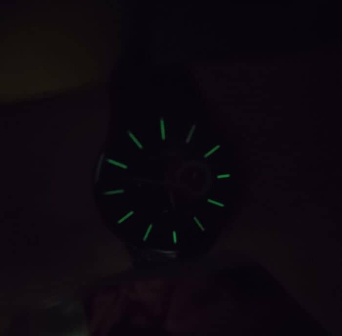
#1 My Watch Has Luminescence On The Hour Markers But Not On The Actual Hands
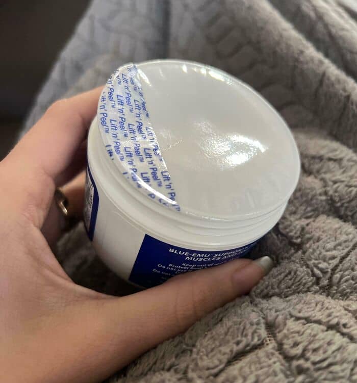
#2 Putting This On Arthritis Cream Is Such A Cruel Joke
So, how do we know if a particular design is good or bad? Jared Spool, an American writer, researcher, and usability expert, said the first test begins with a person walking up: they either know how to use it at that moment or they don’t.
“If they don’t know how to use it,” Spool said, “you have to look at the knowledge they came up with for the design — what we call current knowledge — as well as the knowledge that they need to achieve whatever their objective is.”
“Whether that’s getting money out of the automatic teller machine or looking at a radiological scan and diagnosing an anomaly in the chest cavity, they have to have knowledge to get that task done. If that knowledge is far away from the knowledge they currently have then they’re going to have to either learn how to do it or the design is going to have to be simplified so they no longer need that knowledge,” he explained.
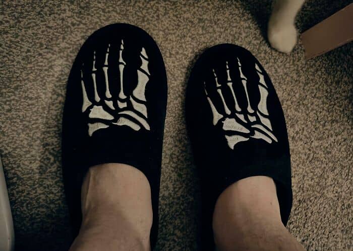
#3 My Feet Hurt Just Looking At This
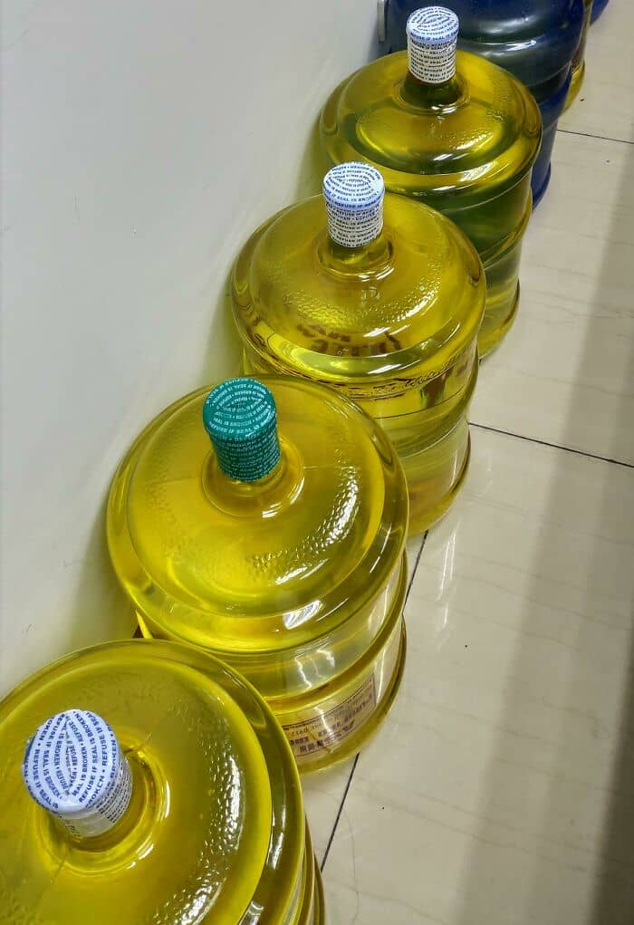
#4 Yellow As A Container Color For Gallons Of Drinking Water
#5 Whoever Came Up With This Design Should Be Fired
The space between the two is called the knowledge gap, and Spool said a design is intuitive (good) when that gap is very small.
“It could be so small that when I walk up to the design, I instantly know what to do because everything in my previous life’s experience has taught me how to deal with this, even if it’s something I’ve never seen before – I can walk up to an automatic teller machine that I’ve never seen before, and I can operate it because my experience with other automatic teller machines has told me what to do, for example,” he said.
“Or I get trained, but that happens so quickly that I don’t even notice it. There’s messaging on the screen, or there are helpful graphics and animations, and those things … tell me what to do, and it takes me milliseconds to traverse that knowledge gap. That’s intuitive. Something is intuitive when I walk up to it, and I know what to do.”
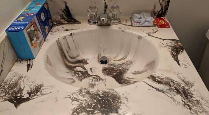
#6 It Looks Like Dirt
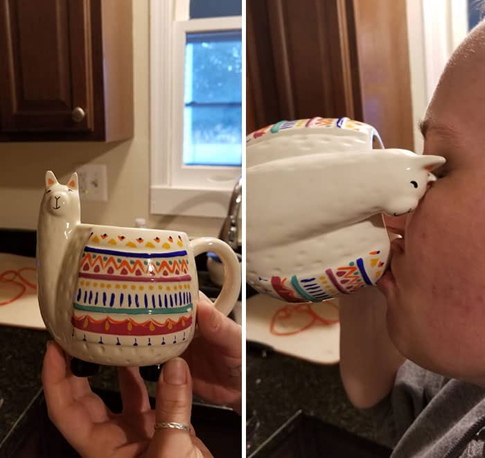
#7 I’ll See Your Cat And Raise You A Llama
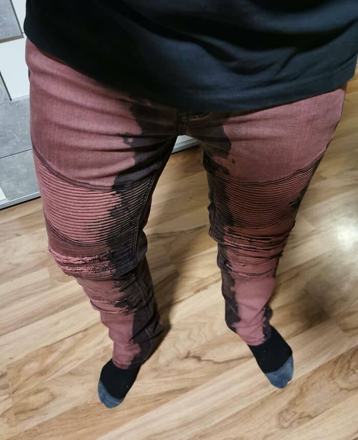
#8 Pants That Make You Look Like You Peed
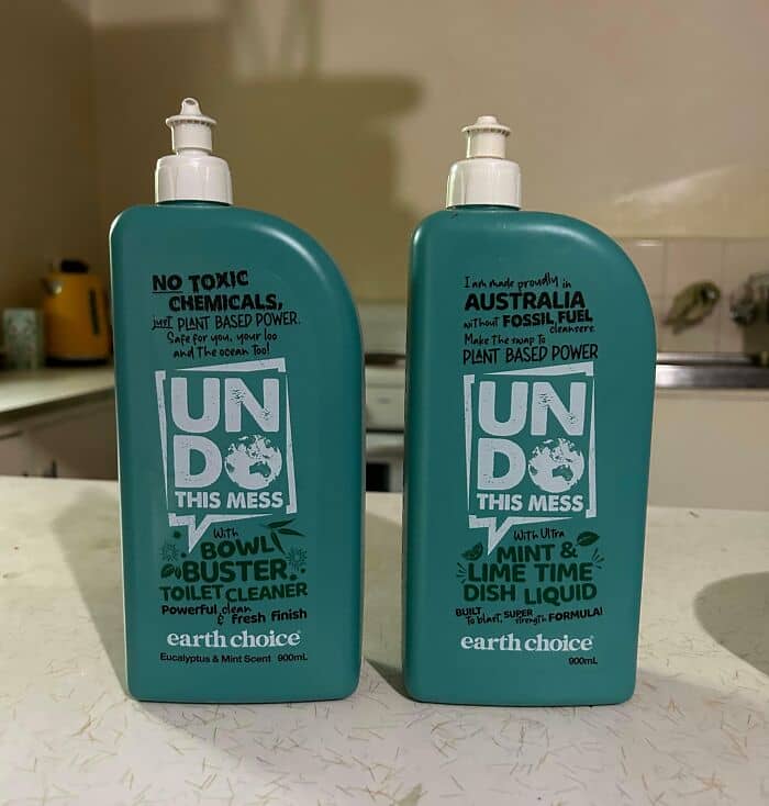
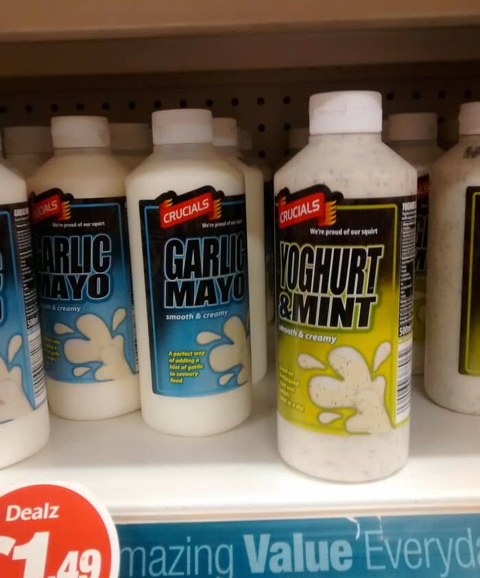
#9 One Is A Toilet Cleaner, The Other Is For Washing Dishes. Choose Wisely
That might sometimes sound like an impossible task because the world keeps changing, but Spool believes that humans don’t.
“Humans haven’t changed; we haven’t evolved one bit. In fact, here in the United States, it’s possible we’ve gone in the other direction,” he said.
“Technology changes, but people stay the same, their behavior stays the same, their ability to respond to something stays the same. How big our fingers are, how fast we move, what our reaction times are, how quickly we interpret information, all of that has stayed the same. The problems that people have, they don’t change – we still need to communicate, coordinate, and collaborate.”
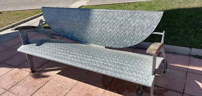
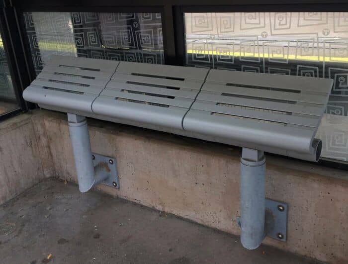
#10 This Bench. Where I Live It Is Very Hot And It Is Impossible To Sit In This Park
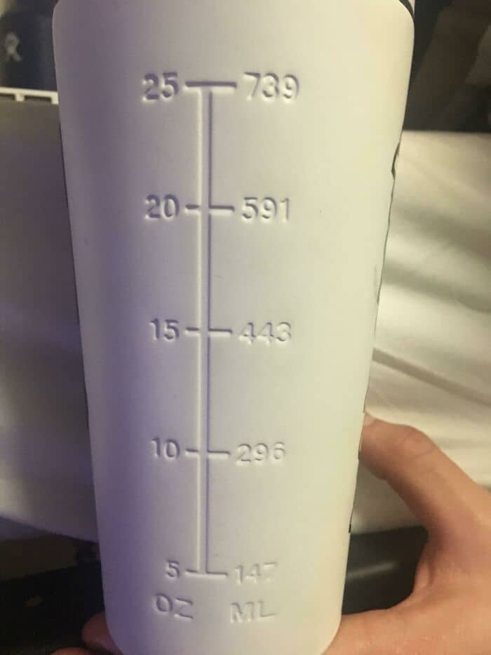
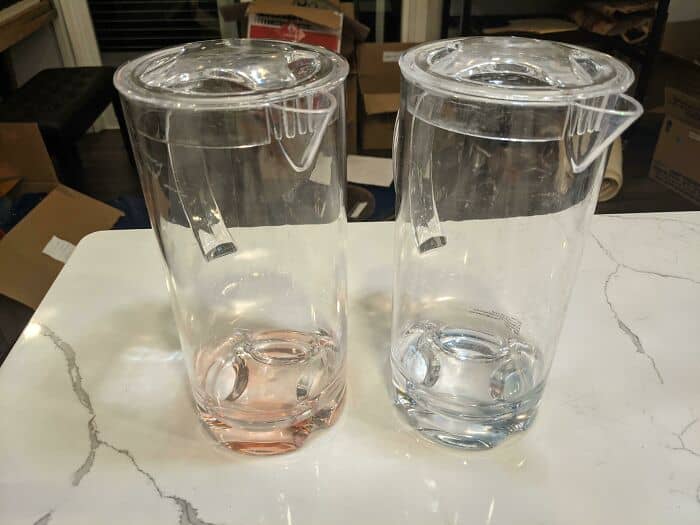
#11 This Water Bottle Has Markings To Show You How Much Liquid Is In It, But You Can’t See Through The Bottle
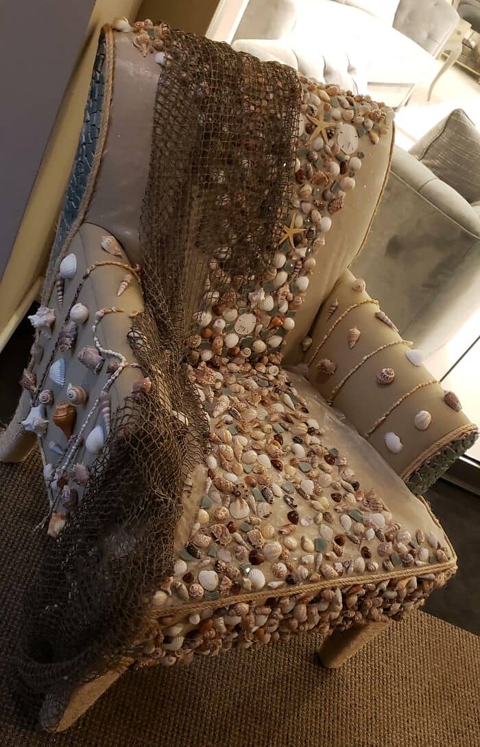
#12 This Unsittable Seashell Chair
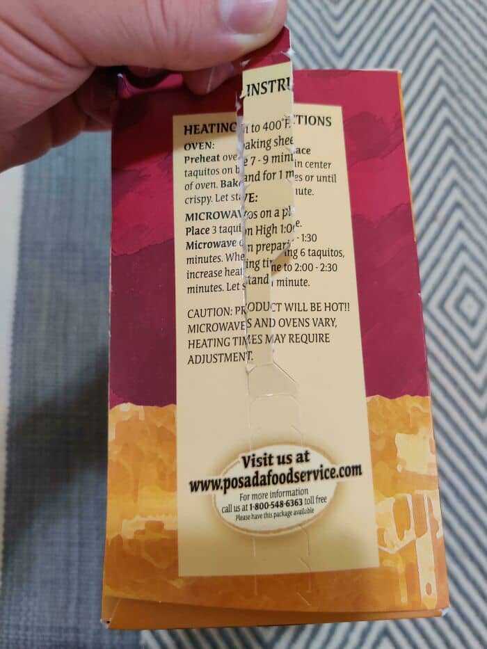
#13 Opening The Box With The Pull Tab Destroys Both Heating Instructions And Customer Service Contact Number
Spool continued to describe how this manifests in people’s relationship with design.
“What I mean is on the process side of things people still want everything to be so easy that they don’t have to do any work. They don’t want to have to invest in figuring out what the design should be; they just want to be able to wave their hand and make it happen.”
He has also observed “this constant reluctance to invest in good design” and believes it’s partially because there’s no pressure for it.
“A lot of organizations just don’t have this basic sense that design is going to make a difference, and that’s coupled with the fact that many people aren’t literate in design. By literate in design, I mean they can’t tell the difference between a good design and a bad design.”
So when our grandparents struggle with a new device or app, it might not be their skills that are the problem—maybe the design just isn’t good enough.
#14 The Handle Of This Pan Is Heavier Than The Actual Pan
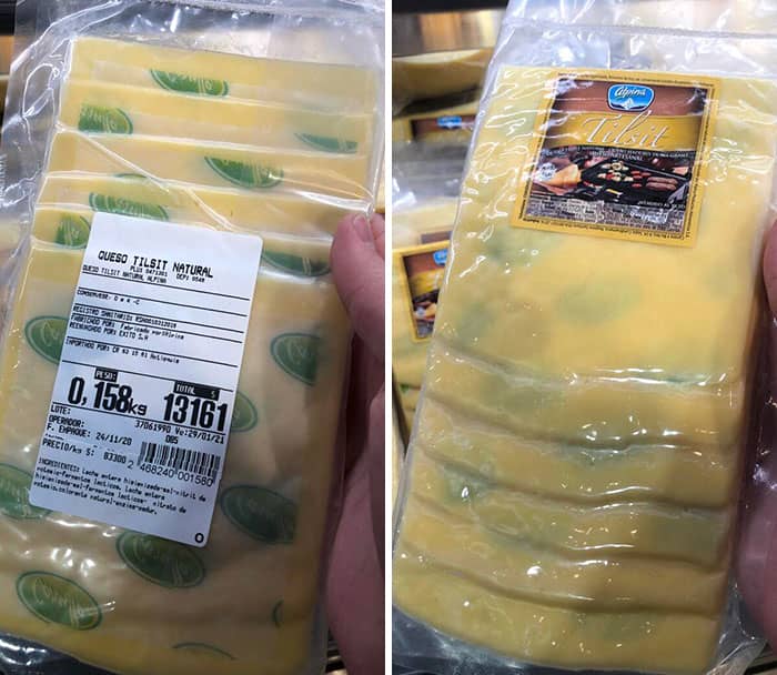
#15 The Paper In This Sliced Cheese Makes It Look Like It Has Mold Spots
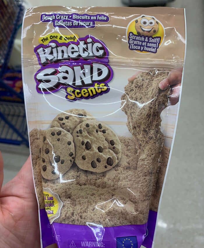
#16 How To Get Children To Eat Sand
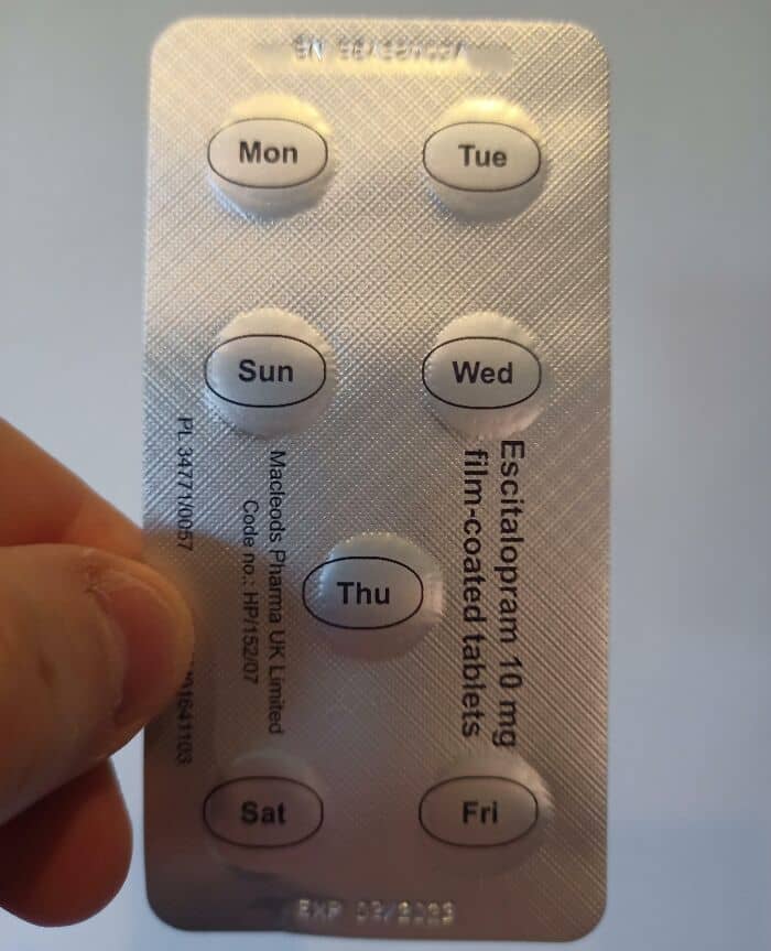
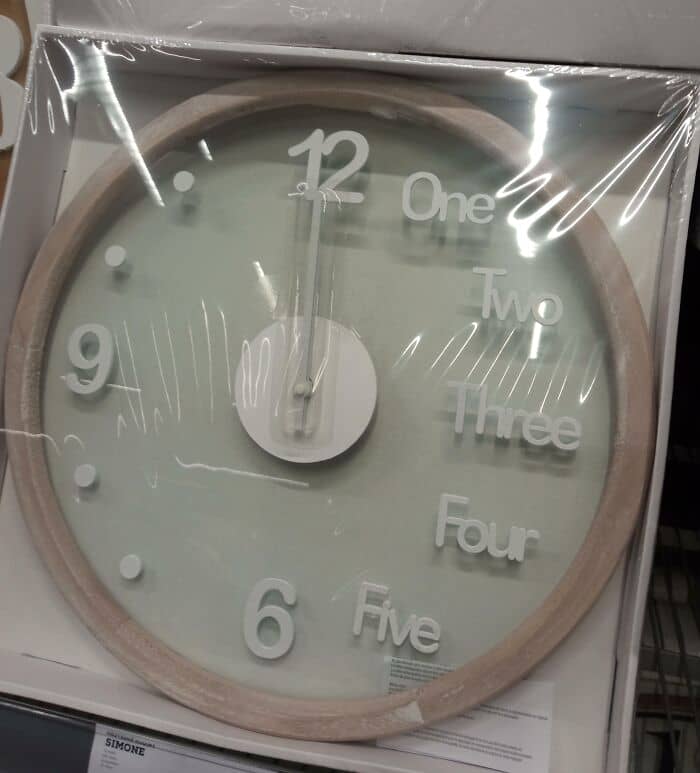
#17 The Day Layout Of These Pills
Following this logic, we can say that a good design renders intention well and matches what the users need. A bad design, on the other hand, doesn’t render intention well and doesn’t match what the users need.
“You can measure design on a scale of frustration to delight,” Spool suggested. “When people have complained about a bad design it’s always because the design is frustrating them. When they’re enamored with a great design, it’s because it’s delighting them.”
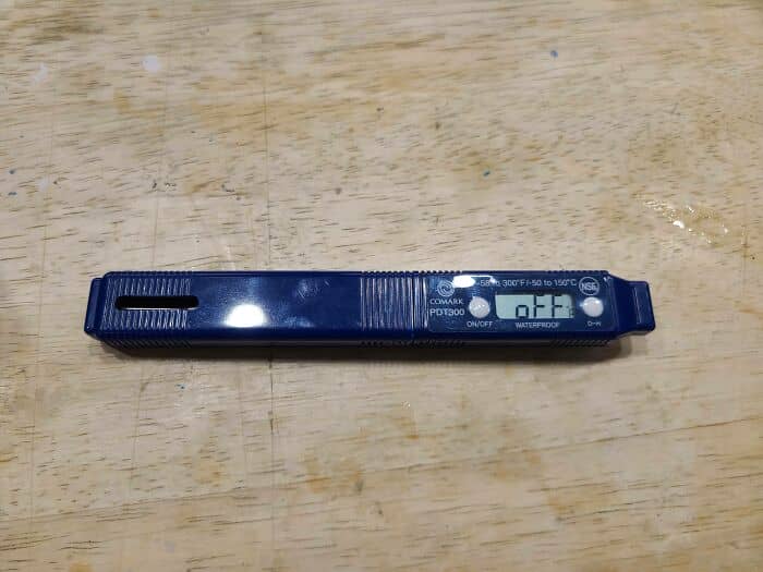
#18 Instead Of Making These Thermometers Turn Off They Just Stay On And Display The Word “Off” Making Them Run Their Batteries Faster Than Other Models We Used To Have At My Job
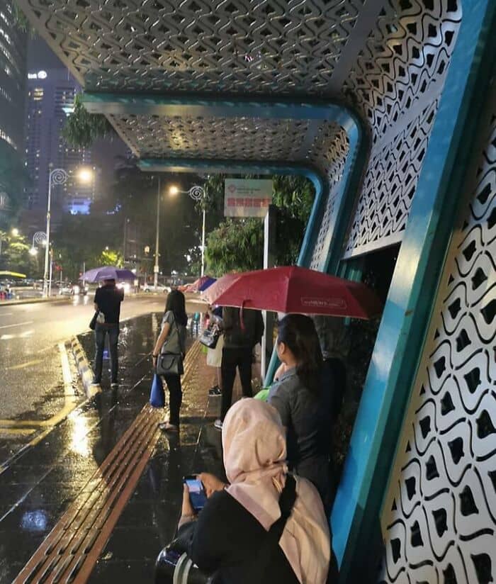
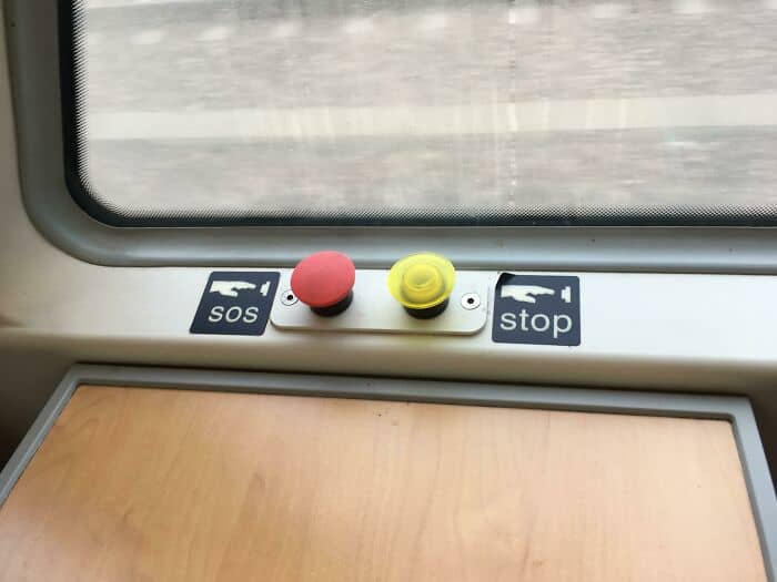
#19 This Bus Stop In Malaysia
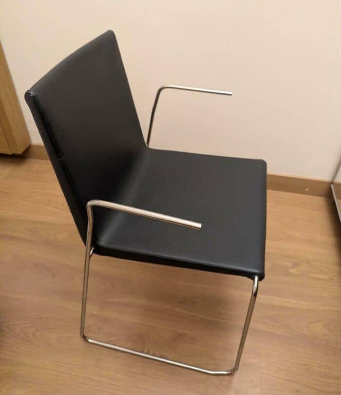
#20 These Bare Metal Armrests On My Hotel Chair. I Asked, They Said These Are By Design
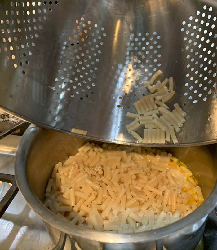
#21 This IKEA Colander Has A Lip That Curves Inward That Traps Pasta
However, Spool said some organizations (designers) believe it’s not important whether or not they frustrate their users, partially because they feel like the users don’t have a choice.
“For instance, if you work in a company and you want to get reimbursed for the expenses that you made during travel, you can use the travel expense system, and if it’s incredibly frustrating, they don’t care because that’s the only way you’re going to get your travel expenses reimbursed,” he said.
So it very well might be that we will continue seeing bad design and creating such lists no matter how far the craft itself progresses.
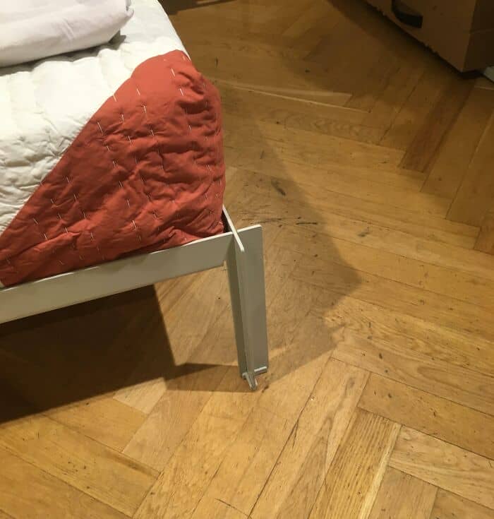
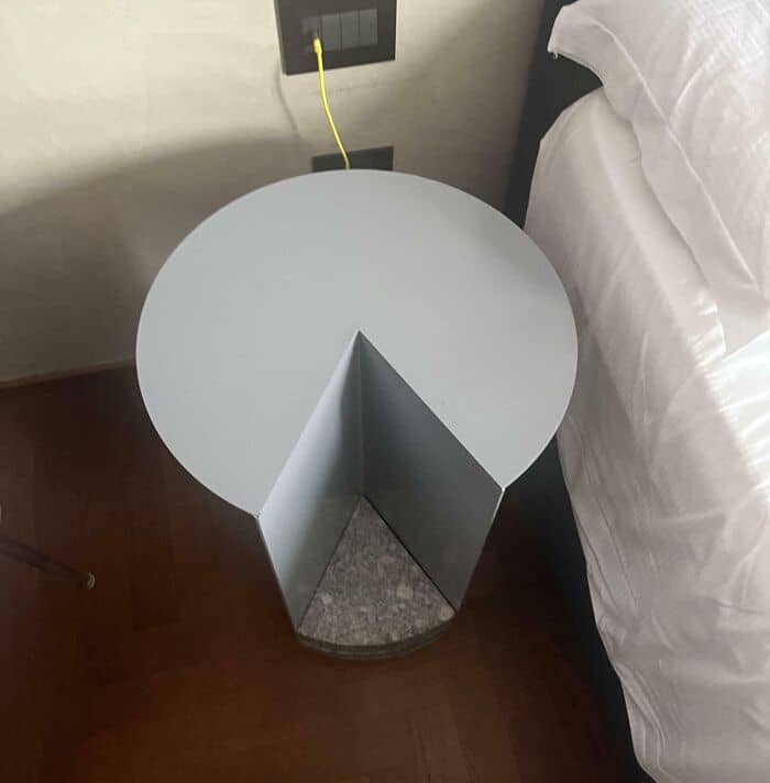
#22 Maybe Not Best Design For End Table At Hotel Where You Place Items In The Dark Before Bed
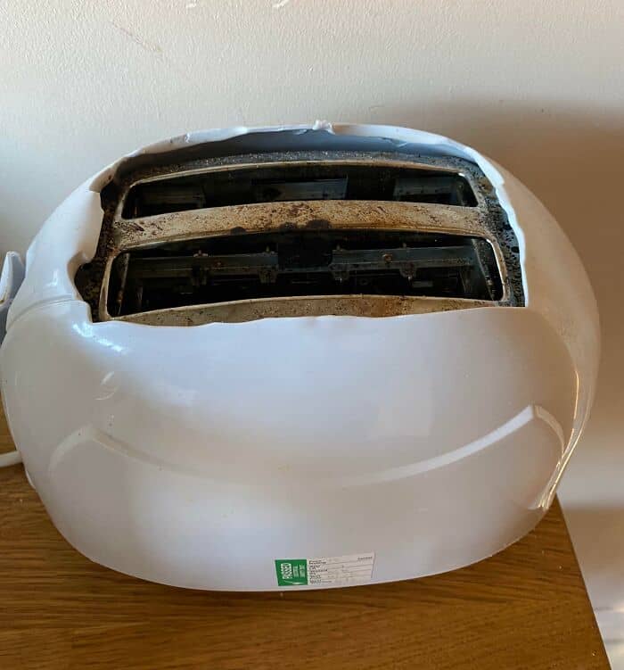
#23 This Toaster Toasts The Plastic Surrounding Your Breakfast
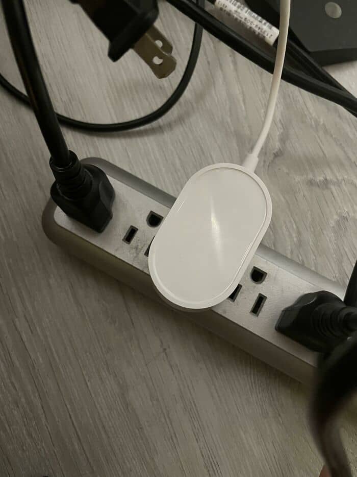
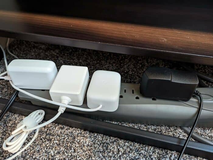
#24 I Hate These Plug Designs So Much. Why Do Companies Do This?
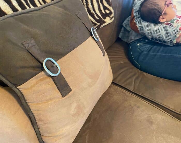
#25 The Buckles On This Pillow Are An Eye-Poking Hazard
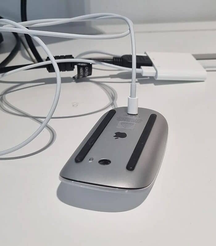
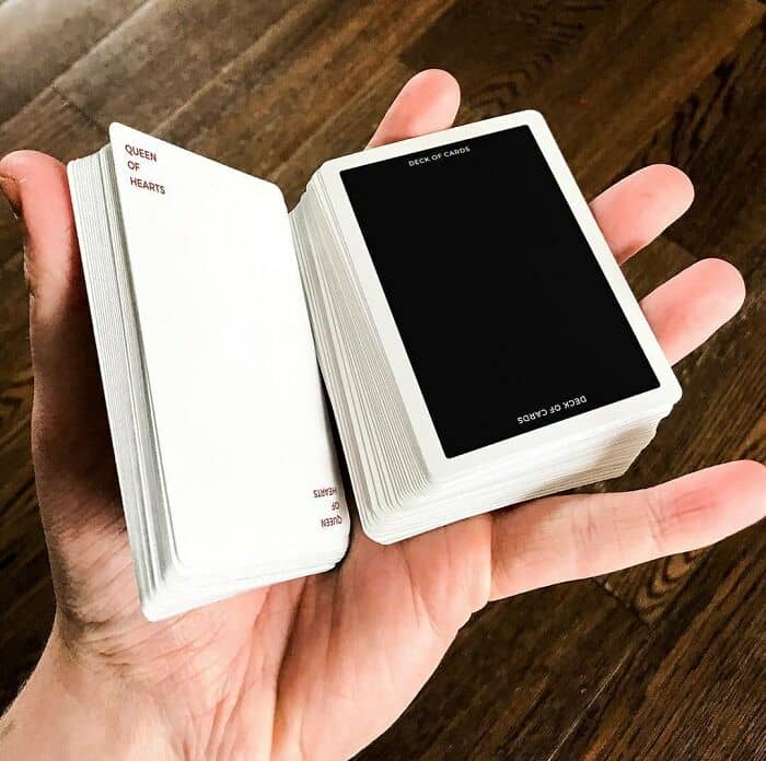
#26 Bad Design At Its Best – How To Charge The Magic Mouse For Mac
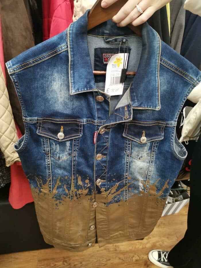
#27 For That, Dipped In Mud Look
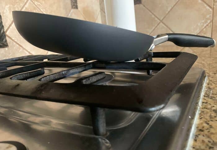
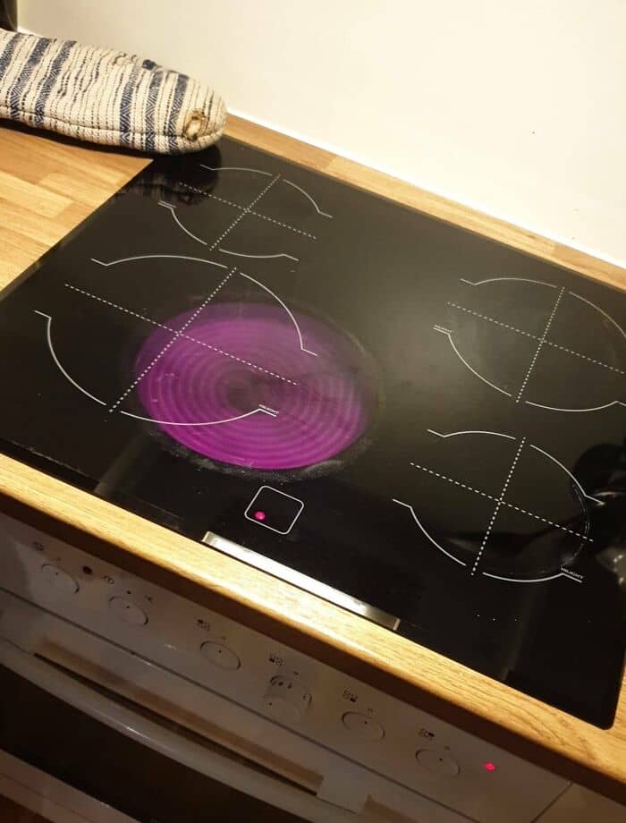
#28 This Cooktop
#29 Mildly Infuriating Level : Refund
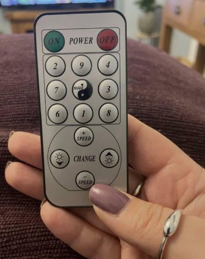
#30 The Arrangement Of The Buttons On This Remote
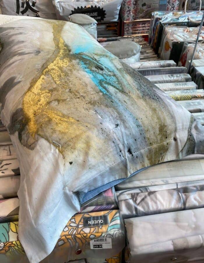
#31 I Don’t Feel Like Sleeping Soundly On This Pillow At All
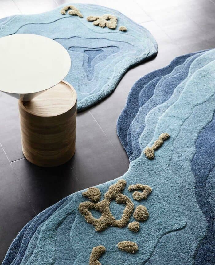
#32 This High-End Rug That Appears To Have Been Pooped On
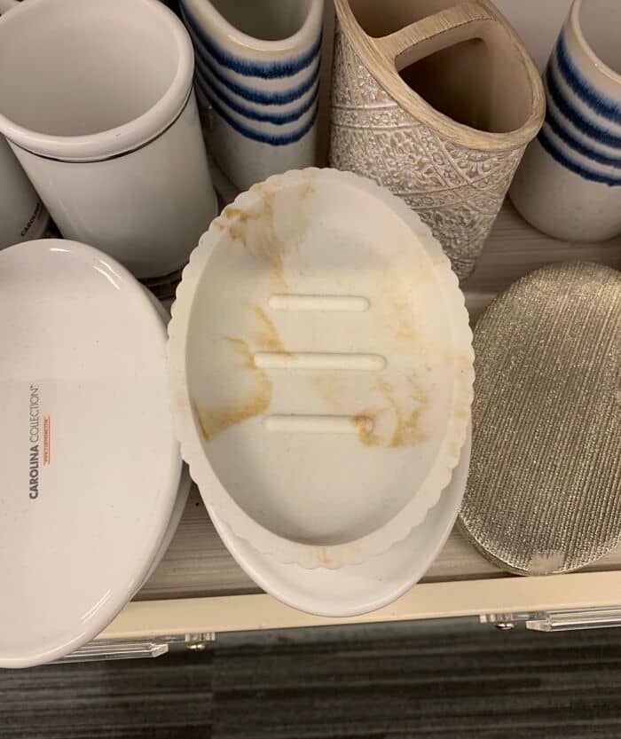
#33 This Soap Dish Looks Filthy
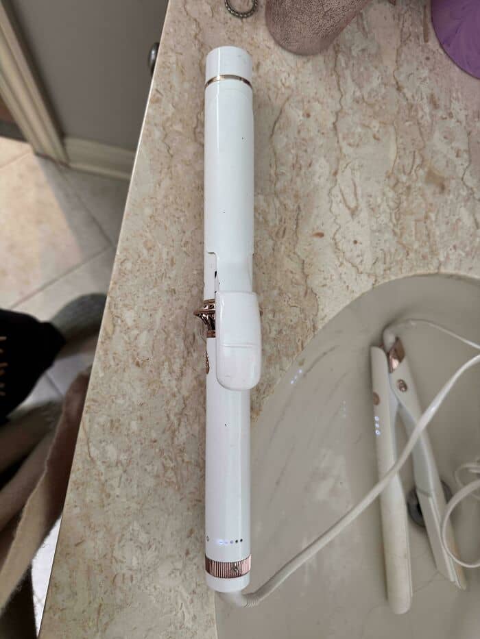
#34 Curling Iron.. Way Too Easy To Grab The Hot Side
#35 I Have Nothing To Say
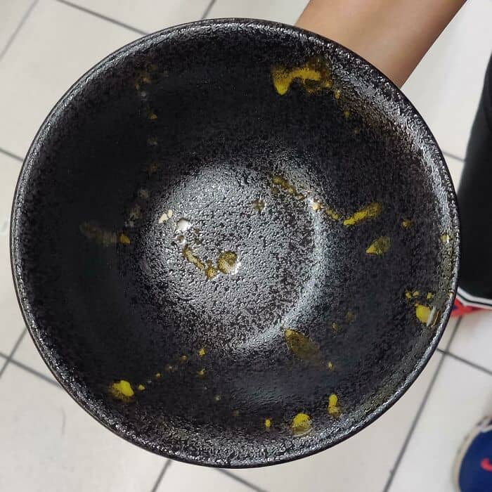
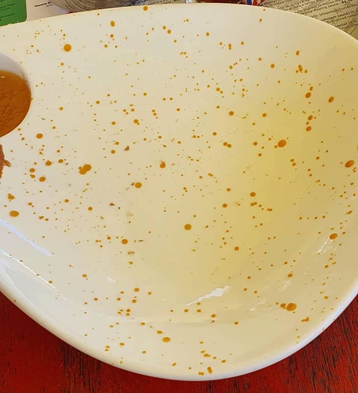
#36 This Bowl Looks Like It’s Perpetually Dirty
#37 A Chair With Closed Holes. So The Dust And Dirt That Enters It Stays !
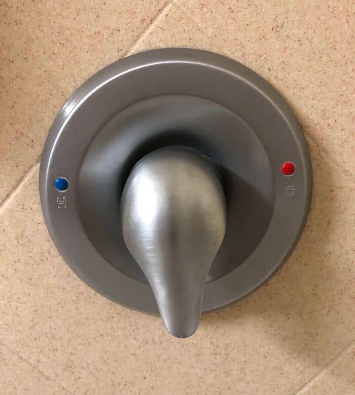
#38 This Tap Was Made With Little To No Thinking
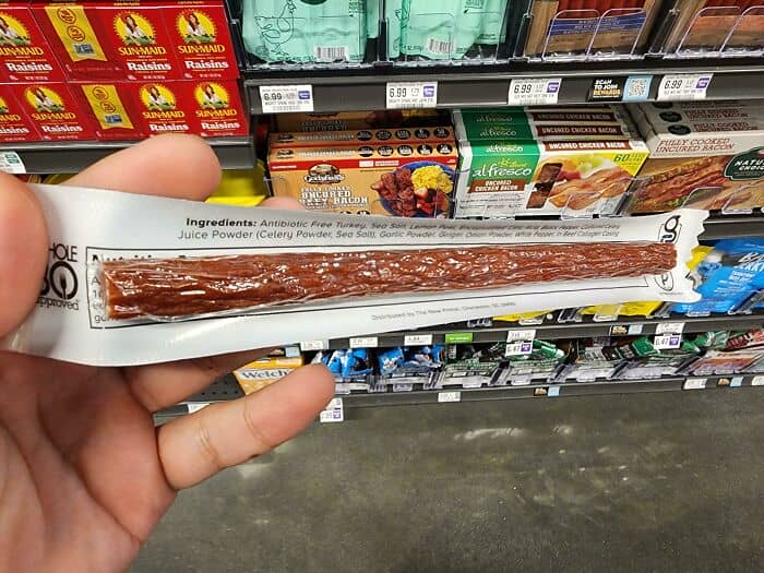
#39 A Nutrition Label That You Can’t Read Until You Buy And Open The Product
#40 Wife Got Me Some Slippers. The Design Is Getting On My Nerves
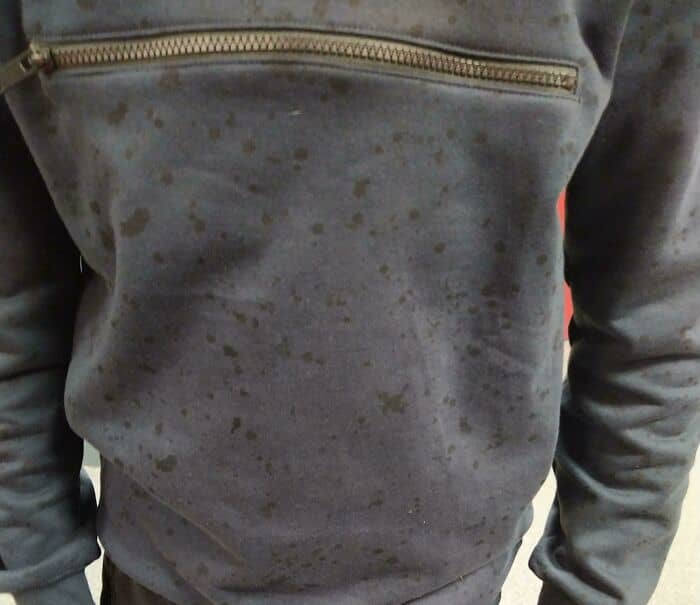
#41 Got This New Hoodie And Everybody Has Asked Me Why I Am Wet And I Have To Tell Them Its Just The Design Of The Hoodie
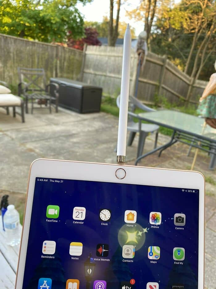
#42 This Is How You Charge Your 100 Dollar Ipencil
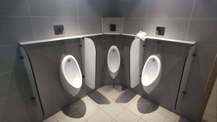
#43 This Urinal Design In My University In Beijing
#44 Useless Minimalism, Stop That
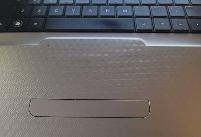
#45 Hp Made The Track Pad The Same Texture As The Rest Of The Laptop So Its Awful To Use
#46 What The Hell You Putting In That
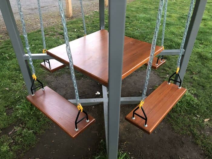
#47 Why Have A Picnic Table And A Swing, When You Can Have The Worst Of Both Worlds?
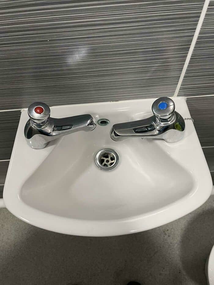
#48 The Worst Sink Design I’ve Ever Had The Misfortune Of Using
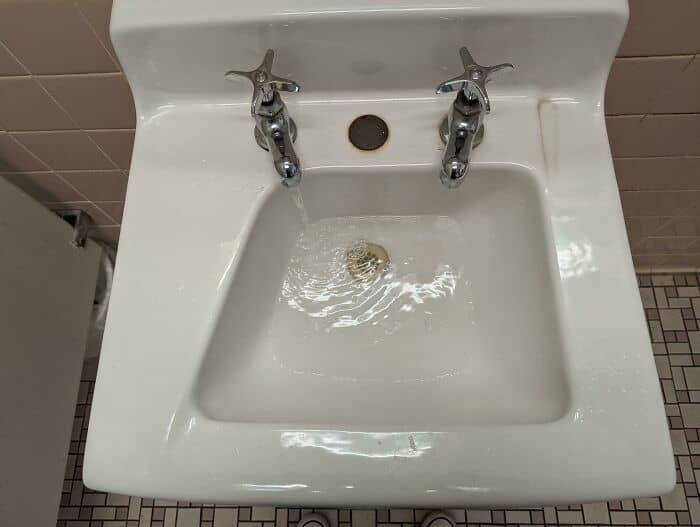
Left side is hot only. Right side is cold. Hands were constantly hitting the side of the sink because there was no room. Took forever to drain.
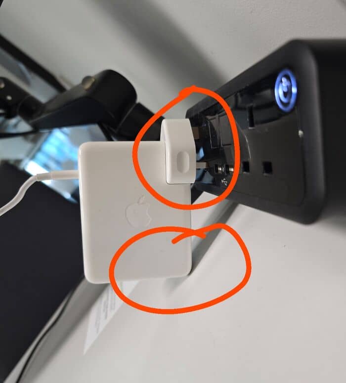
#49 Not Sure Who I Should Be Mad At. Apple Or The Guy Who Designed This Outlet In My Office
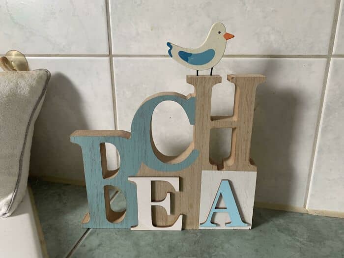
#50 My Mum Bought This At A Home Decor Shop Years Ago. I Never Read What It’s Intended To Say
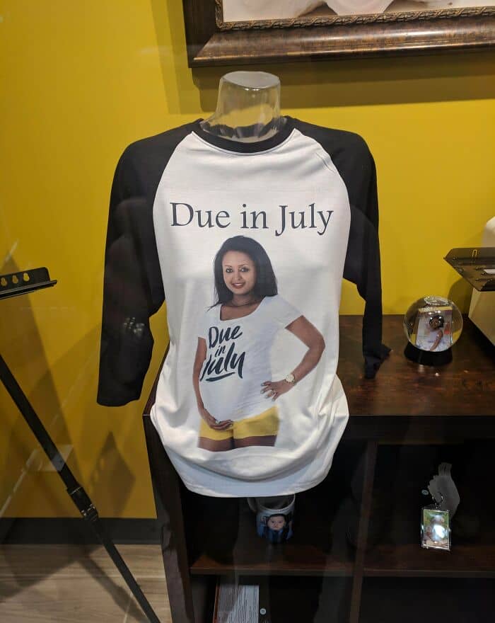
#51 Exactly What I Want On My Shirt: Someone Else Wearing A Similar Shirt
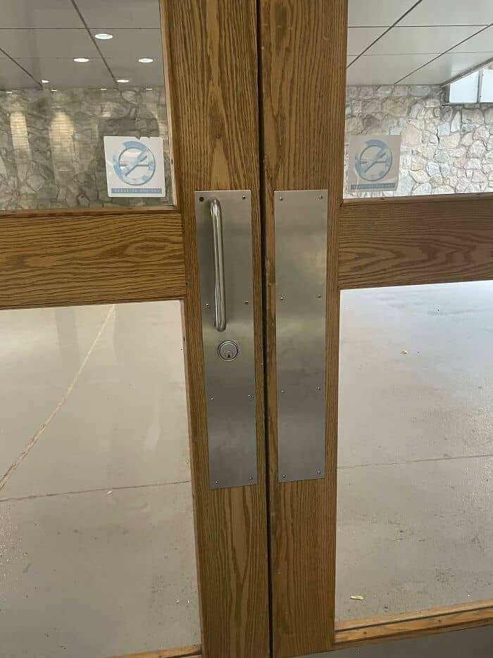
#52 The Words They Chose To Have Standout Color
#53 Can You Think Of A More Disgusting Location For A Bottle Opener Than The Bottom Of Your Shoe? I Cannot
#54 Dog? Silhouette At A Well-Known Big Box Store
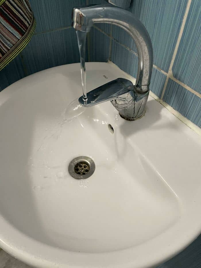
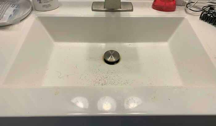
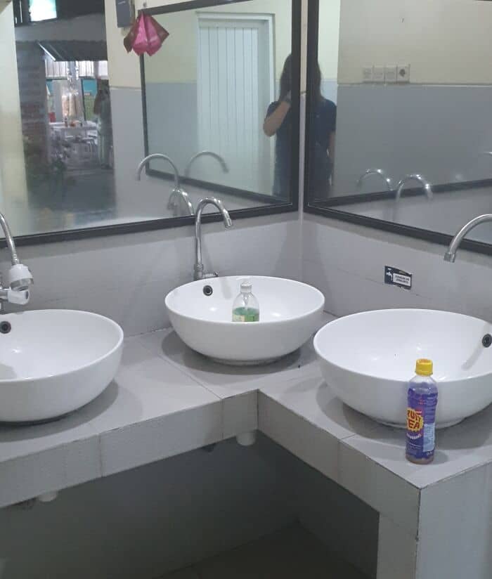
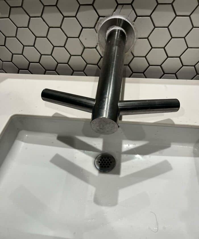
#55 My Local Sink
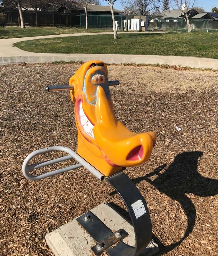
#56 “No, Mr. Policeman Firefighter Rescue Paramedic Sir, I Just Wanted To Get Off At The Next Stop”
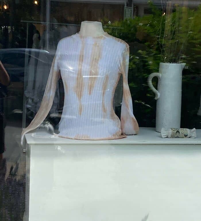
#57 This Shirt That Looks Like It’s Covered In Coffee Stains
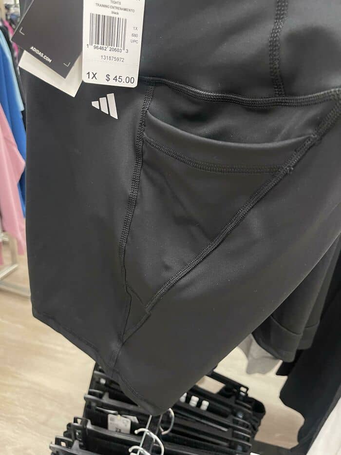
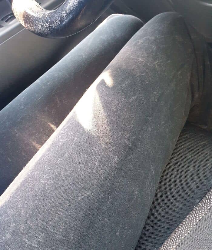
#58 The Design On My Girlfriend’s Yoga Pants Make It Look Like It’s Covered In Fur
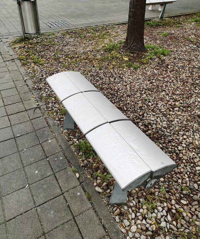
#59 These “Benches” Are Super Uncomfortable To Sit On And Unusable To Rest (Probably Designed Against Homeless People)
#60 Modern Ui Design Is Really Really Awful. Case In Point: Can You Tell In Less Than 2 Seconds Which Item On This Screen Is Highlighted?
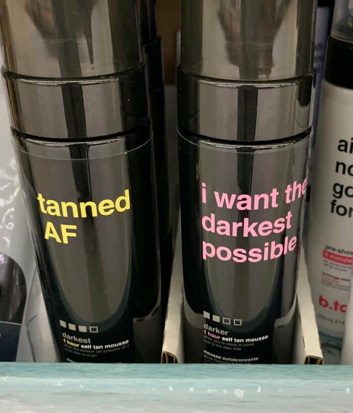
#61 The “Tanned Meter” At The Bottom Doesn’t Coincide With The Product Name
#62 The Designer Of This Abomination Should Be Made To Sit On This For A Week
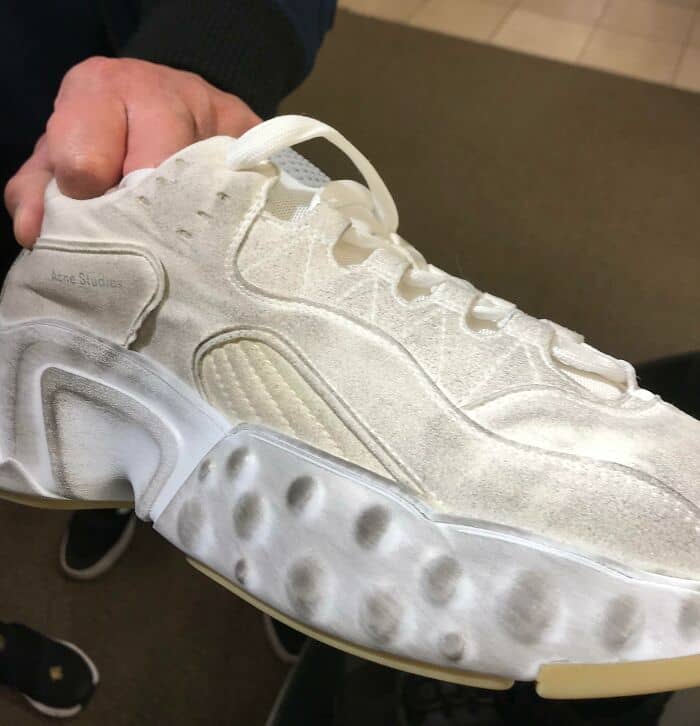
#63 These Shoes Are $500 And The Design Makes Them Look Dirty
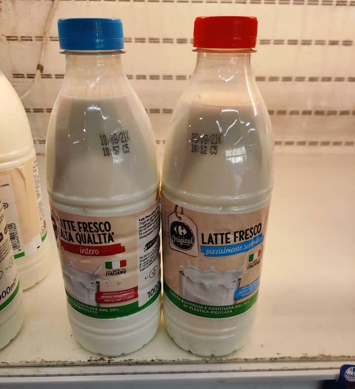
#64 So Which Way Is Hot?
#65 These Sauces Look Like Car Cleaning Products
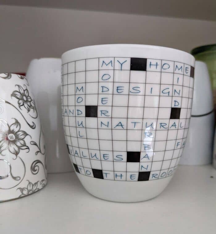
#66 That’s Not How Crosswords Work
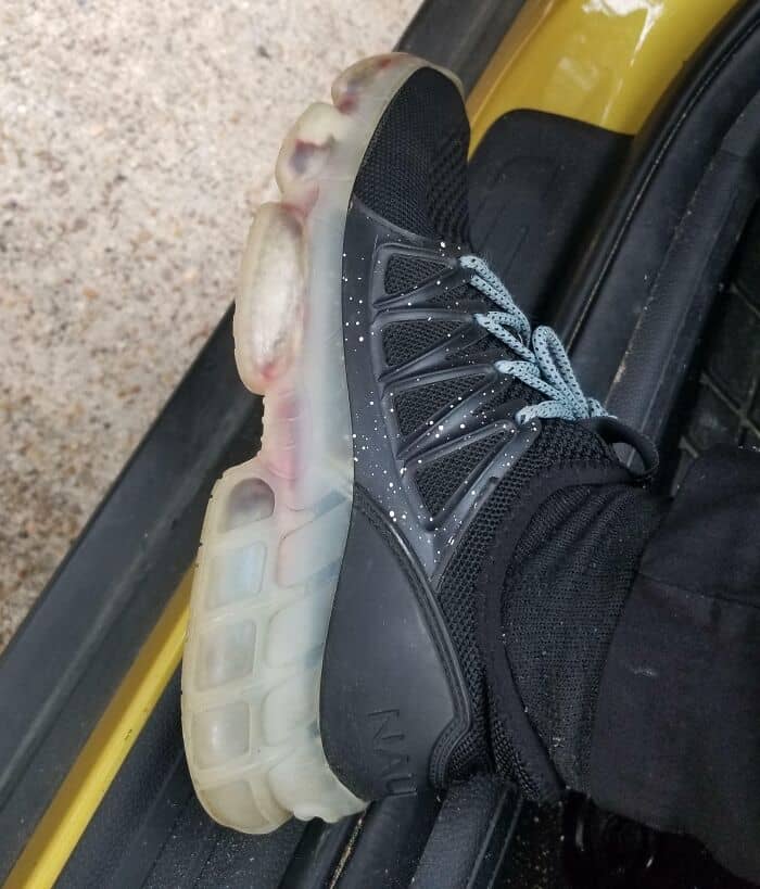
#67 Shoe Has Holes In The Plastic Sole That Let’s Water Pass In Between The Styrophome And The Plastic. Results Are A Mobile Pitre Dish
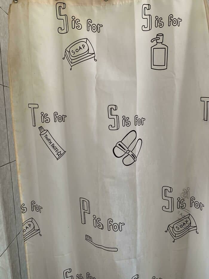
#68 P Is For?
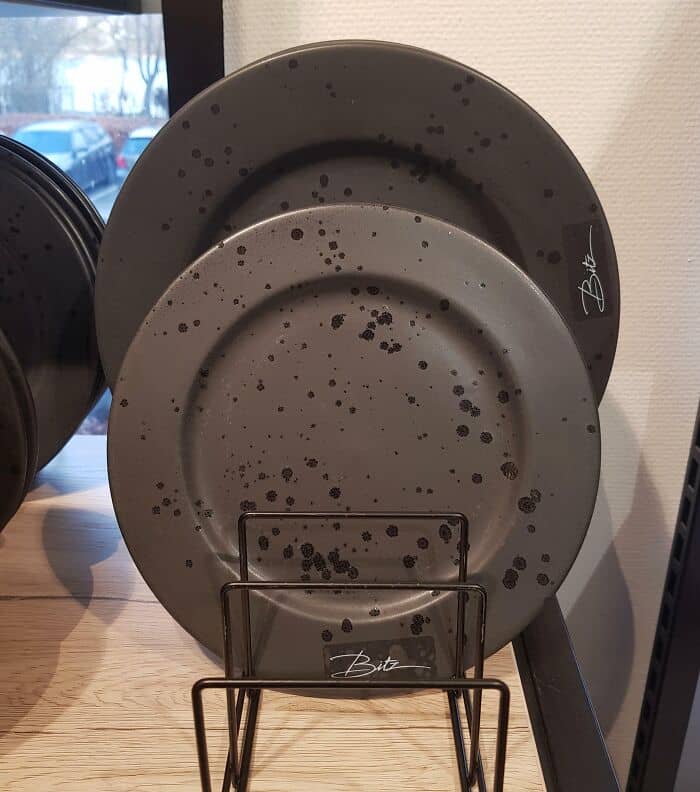
#69 These Plates That Will Always Look Dirty
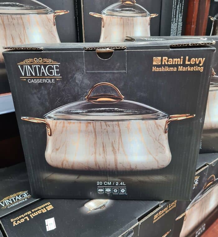
#70 Why Would I Buy A Dirty Cooking Pot?
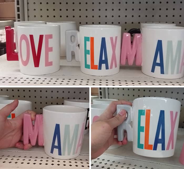
#71 Look At What I Found, How Are You Supposed To Hold This Mugs ??
#72 Left Is Push And Right Is Pull
#73 Who’s Stupider? The Designer, The Retailer Or The Purchaser Of The Flat-Bottom Sink?? It’s Me. I’m Sure I’m The Stupid One…
#74 This Is What Graphic Designers Will Make After Attending Online School
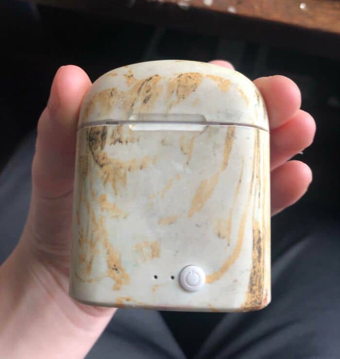
#75 The Design In This Fake Airpod Case Makes It Look Like It’s Dirty
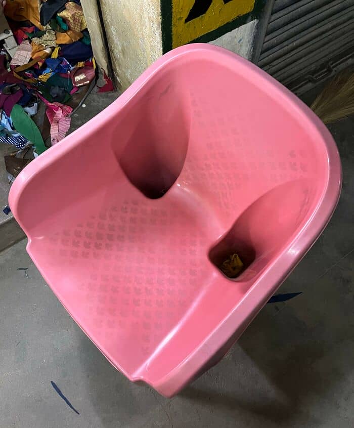
#76 Your Supposed To Sit On It’s Face
#77 This Plate With Fake Stains, Why?
#78 Not Actually Dirty, Just Purposely Colored To Make You Think You Left Some Kool-Aid At The Bottom
#79 When You Use Moveobjects_on In The Sims To Add More Objects On Your Counters
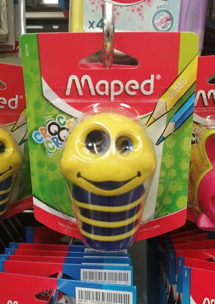
#80 Pencil Sharpener Found In The Kids Section
#81 This Is Such A Dumb Design. This Is In A Mcdonalds. It’s A Hand Dryer. Water From The Sink Got On My Shirt. At Least The Sink Was Relatively Clean..
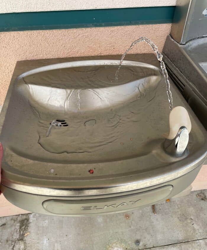
#82 My School Put The Water Fountain Nozzle Backwards
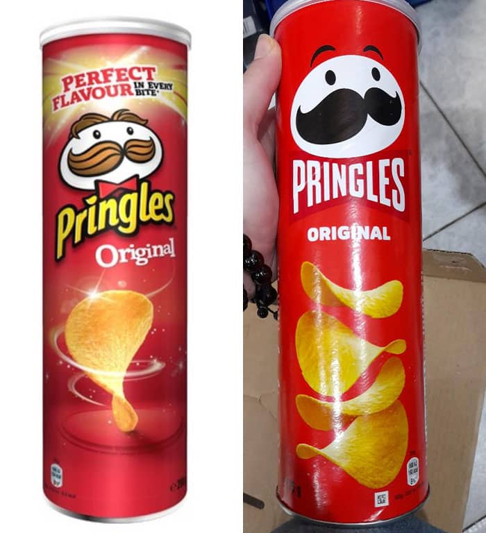
#83 The Old Pringles Logo Next To The New. The New One Looks So Plain
#84 The Skim Milk Has A Blue Logo And A Red Cap. The Whole Milk Has A Red Logo And Blue Cap. Why?